UX RESEARCH INTERACTION DESIGN UX/UI IA ROADMAPPING ANALYTICS
Improving the usability of an out-of-date design editor to improve upgrade conversion by 61%
UX RESEARCH INTERACTION DESIGN UX/UI IA ROADMAPPING ANALYTICS
Product development at Venngage was slowing due to technical debt
Venngage is a web-based graphic design platform, launched in 2015. By 2021, product development within the design editor, the core of Venngage’s product, was slowing due to technical debt.
To allow us to ship more quickly and reposition Venngage as an accessible design platform, technical leaders decided it was time to rebuild the editor from the ground up.
We’ve been working since the spring of 2022 to design, build, and launch a new editor.
As the lead designer on the project, I was responsible for:
I worked alongside a junior product designer, a QA, a tech lead, and 5-8 developers in an autonomous, Agile squad.
We started alpha testing in 3 months, launched a beta in 6 months, and released to all users in 8 months. We're now working towards feature parity with the old editor.
Significantly improved upgrade and design completion rates for new users
By redesigning the editor we increased upgrade rates for new users by 61%.
As part of the redesign, we:
To kick off the project I performed a usability evaluation, interviewed internal and external users, carried out a customer support analysis, and a quick competitive analysis.
This data, alongside quantitative analyses of analytics data from our existing editor, would inform the planning and prioritization of our incremental releases over the next year.
While getting started on solving some of the more fundamental issues defined in this early research, I also set out to define some goals and slices that would guide our work within this large project.
Defining a roadmap for alpha, beta, and public launches
The large scope of this project posed a significant challenge—how would we ship valuable slices that would be good enough to entice users to adopt the new editor, while the alternative, a fully-featured editor, was still available?
We had to be strategic about how we defined the scope for alpha, beta, and full public launches. Make them large enough that they provided value and enabled us to get continuous feedback, but small enough that we could ship relatively quickly.
We decided that the objective for alpha would be to evaluate the usability and value of a flow to help users create accessible designs—a new use case we were tackling alongside rebuilding the editor—in moderated interviews.
This way, the editor didn't need to be integrated with our existing product or database, dramatically reducing the amount of work we needed to do before we could get it into users' hands.
We could also offer barebones functionality—single-page designs, a text widget, a few basic shapes, some icons, basic image uploads, and PDF downloads—without worrying too much about the usability of the basic editing experience. This would be enough for users to create complete simple designs, but wouldn't take more than a few months to build. It would allow us to get feedback on the fundamental changes we were making to the editor much faster.
Plus, when we launched our beta, we could position the new editor as a way to make accessible designs, which wasn't possible in the existing editor.
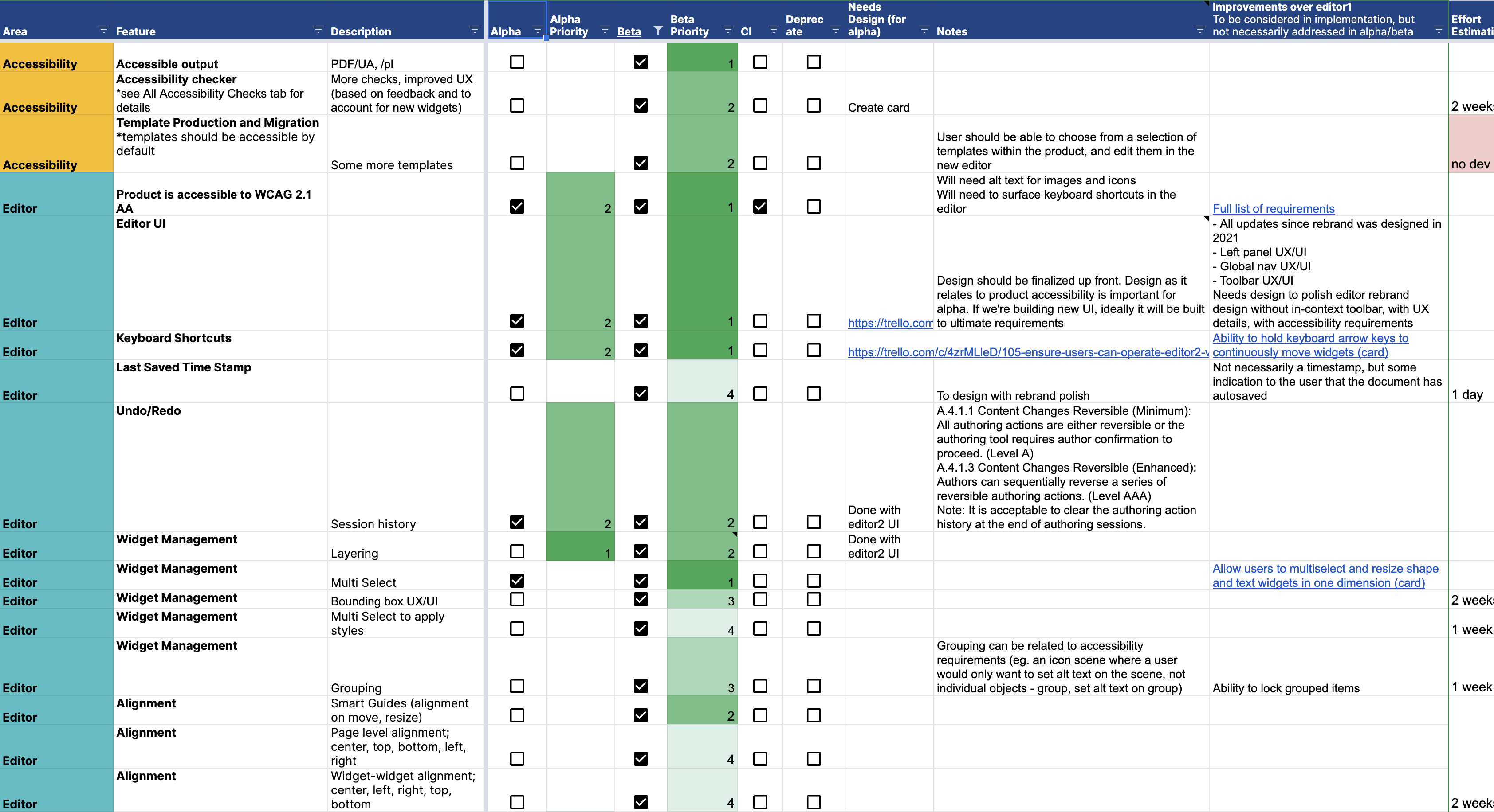
For beta, the editor would need to be a bit more full-featured, since we wanted to get real usage data with existing paid customers. Here, I leveraged analytics data from our existing editor to define critical flows for engaged customers to define a "good-enough" beta scope.
Once we were confident that the basic editing experience was functional and stable (through feedback and usage data from paid customers), our next milestone would be a release to new users. This would allow us to get feedback on the learnability of the new editing experience, unbiased by experiences with the old editor.
At our initial release to new users, upgrade rates from the new editor were similar to those from the old editor.
Leveraging both qualitative and quantitative research (customer interviews, engagement analysis, flow analysis, Hotjar session recordings, and qualitative microsurveys), we designed and prioritized improvements on a weekly basis.
Over the course of a quarter, we significantly improved design completion and upgrade rates - ultimately resulting in upgrade rates 61% higher in the new editor compared to the old editor, with users who created designs in the new editor more likely to complete those designs than those who created in the old editor.
We're currently working towards a full relaunch of Venngage as an accessible design maker, featuring the new editor.
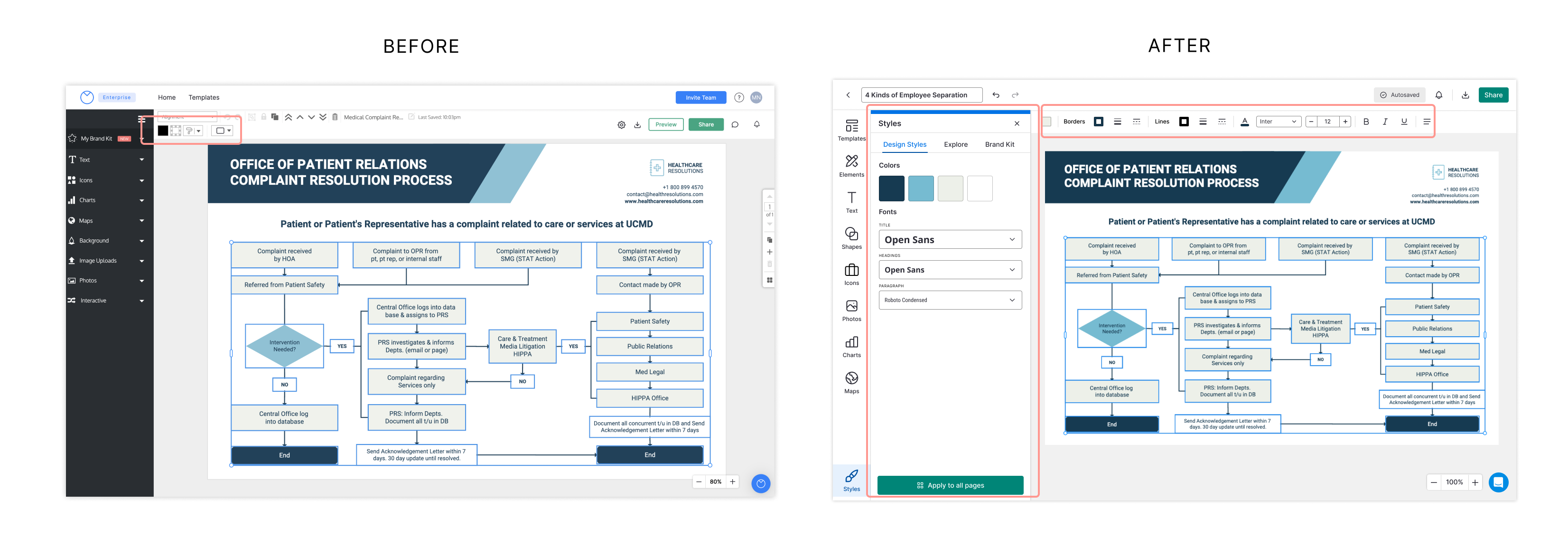
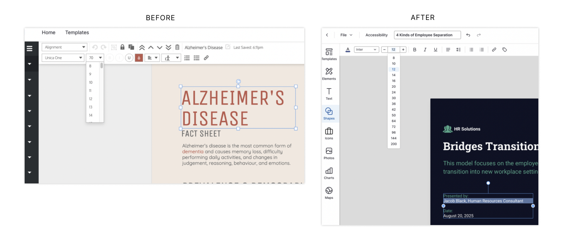
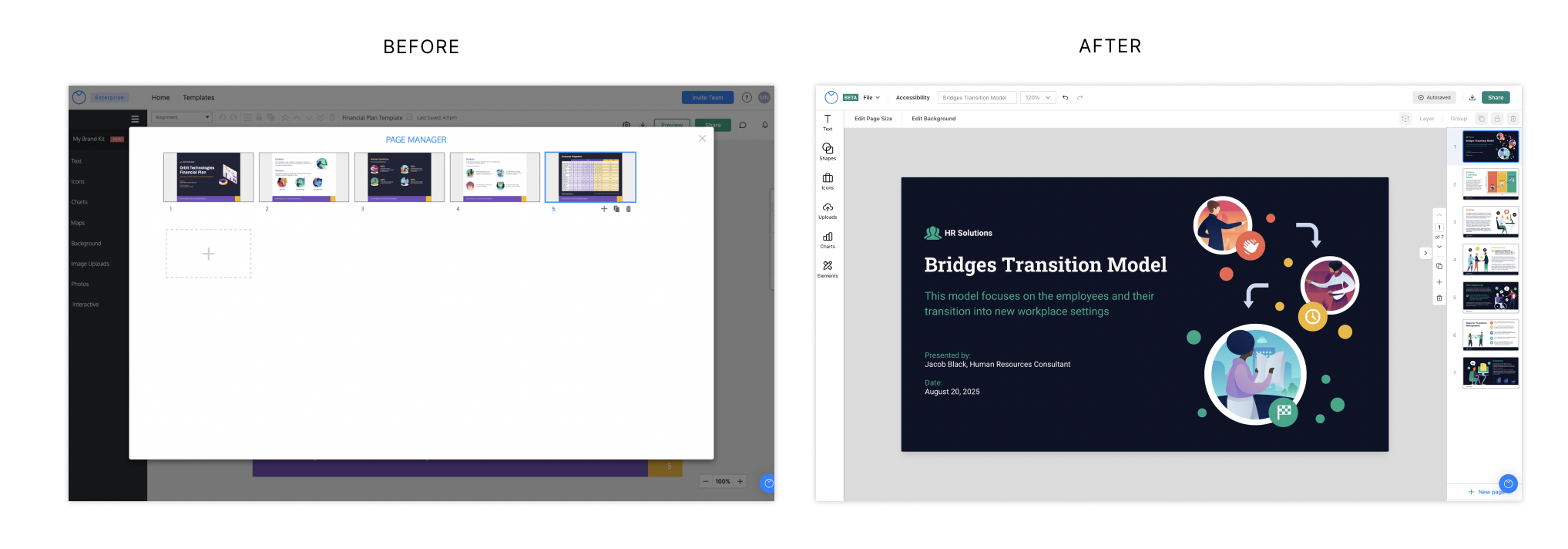
While we made numerous changes to UX details, redesigned a number of widgets, and redesigned the UI alongside building Venngage's first design system, here are some of the more significant usability issues we solved in the redesign.
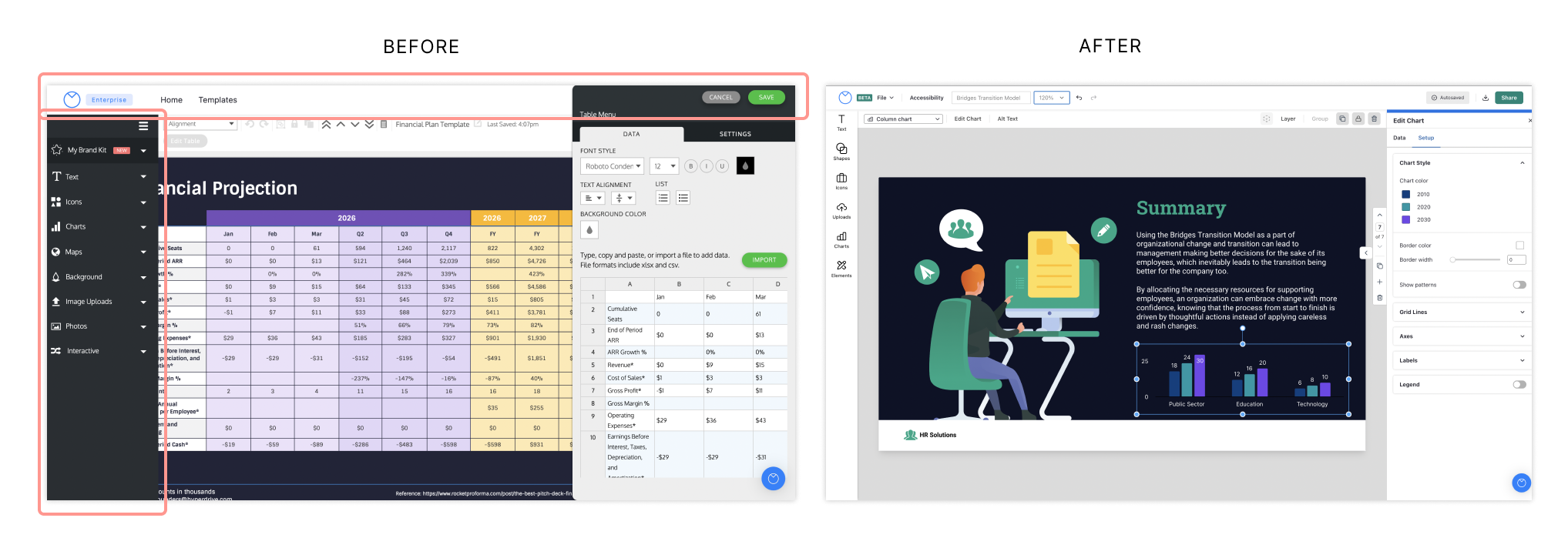
Before:
After:
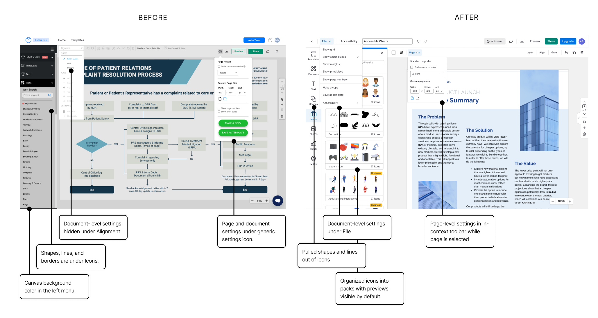
Before:
After:
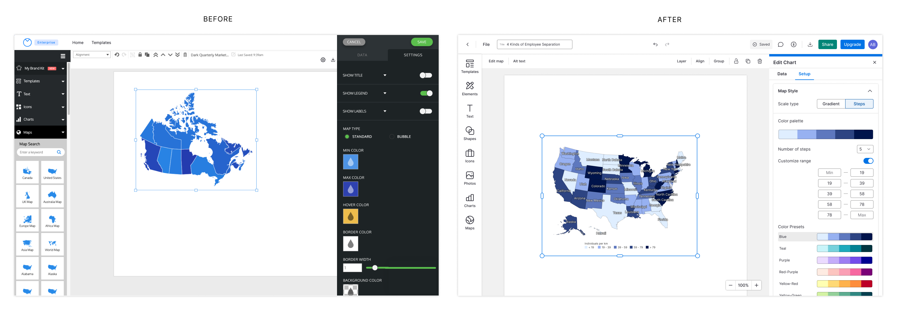
Updated the information architecture, including:
Before:
After:
Many new users weren't aware that widgets could be copied and pasted and would reach out to Support for help. We noticed in contextual interviews that many users right-clicked to copy and paste text into text widgets rather than using keyboard shortcuts.
We added a context menu on right click that contained common editing actions, including copy and paste, and surfaced the keyboard shortcuts for those actions.
👉 For each action available in the context menu, 15-30% of the instances of each action were performed using the context menu (compared to via the toolbar or keyboard shortcuts).
📈 We also saw a ~30% increase in usage of keyboard shortcuts (these weren’t previously surfaced to the user in the UI).
When the text widget was last updated in the old editor, ease of editing the text content was prioritized over all else in the editing experience for the text widget. Clicking once on a text widget would bypass the widget selected state and move directly into a text editing state.
Session recordings revealed a few very common flows that this existing UX wasn't accommodating well.
Despite running into these flows repeatedly, users would continue to make the errors - suggesting to us that the design wasn't aligning with user mental models.
I assessed all of the potential types of edits that a user might intend to make when they interact with a text widget:
With all of the flows in mind, it became clearer that the current drilldown behaviour prioritized too few flows at the expense of too many.
In the new editor, we added an additional state to the text widget interactions:
Many Venngage users work on small screens. Design sizes, especially for more complex designs like diagrams, could get quite large, forcing the user to zoom and and out frequently throughout the design process.
Zoom options are available only via a dropdown, requiring 2 clicks for each change to the zoom level.
📈 We saw a 32% increase in zoom usage after the update.
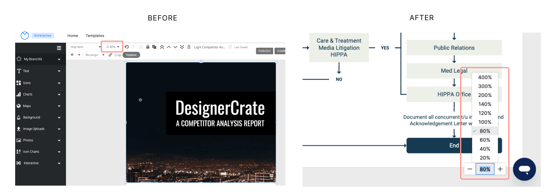
Before:
After:
Before:
After:
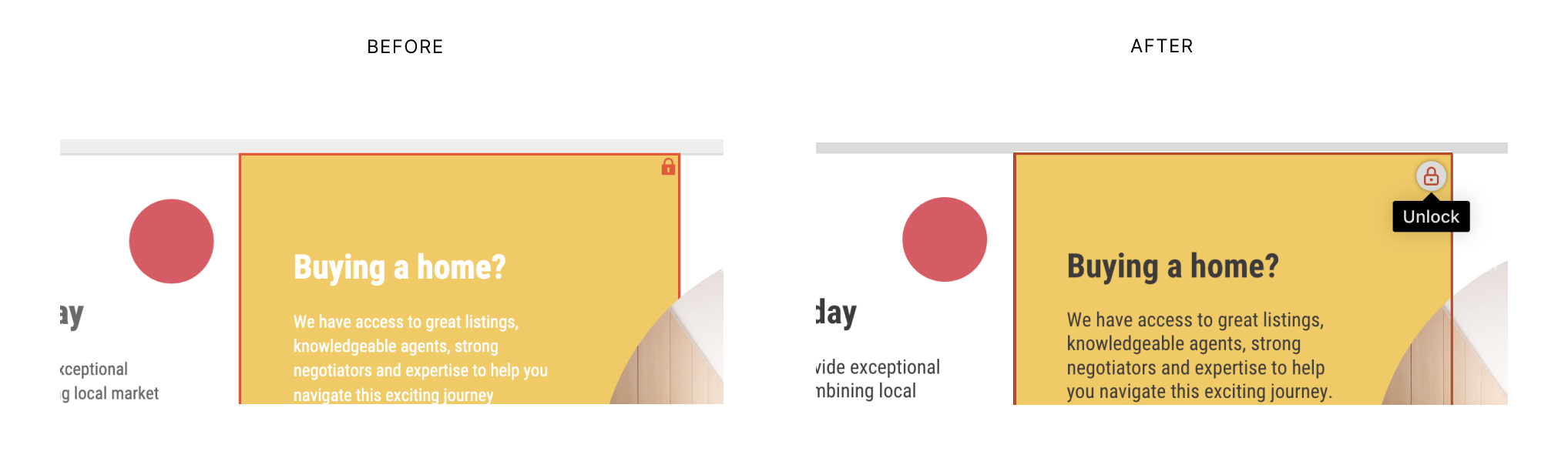
Session recordings revealed that many users struggled to understand that widgets were locked, and needed to be unlocked to be moved or resized. Locking is an important part of template design - locking widgets used as background elements allows for easier editing of foreground elements (which is what most users spend most of their time editing).
The old locked widget bounding box UI relied on color and a small lock symbol that was easily missed.
We tweaked this UI to make the lock icon more noticeable (larger, with a white background) and also made it interactive, so users to click it to unlock the widget, instead of having to go to the in-context toolbar or right click menu.
We're releasing improvements incrementally as we build out features from the original editor.
💪 Today, even though the new editor is still lacking some core functionality, new users that create a design in our new editor are more likely to complete that design, and 61% more likely to upgrade than those who create in the old editor.
We're looking forward to seeing these metrics improve even more as we continue to work towards feature parity.
Based on survey feedback, we think that part of the increase in upgrade rates that we've seen can be attributed to improved learnability and usability in the new editor. But we think that another factor is how we’re presenting gated functionality to the user.
To see if we can further impact upgrades, I'd like to run a few tests around the gating and upgrade flows in the editor.
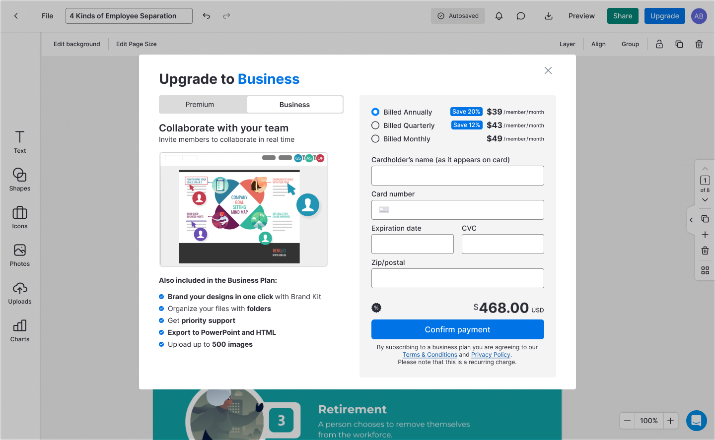
One hypothesis is that allowing users to interact with or preview more of a feature (especially for features where we provide more advanced functionality over alternative solutions) before hitting an upgrade gate will improve upgrade rates, because for some features, like Brand Kit, there's an a-ha moment when the user interacts with the feature, but they're currently blocked from doing so until upgrading.
One solution we're exploring is gating functionality on export, rather than up front, through watermarks or other artifacts.
Another intervention we're exploring is providing unique upgrade modals directly in the editor, that showcase the primary value of each gated feature. Currently, when users interact with a gated feature, they're redirected to a generic subscription page that outlines the features and pricing for all of our subscription plans. By reducing the steps to upgrade, and showcasing each feature's unique value, we may convert more users to customers.