UX RESEARCH INTERACTION DESIGN UX/UI
Designing a responsive, flexible infographic chart widget
UX RESEARCH INTERACTION DESIGN UX/UI
Venngage is a graphic design tool that specializes in infographics
Venngage is a web-based SaaS graphic design tool. Many of Venngage’s core users use the tool to create documents like infographics, reports, presentations, and diagrams to aid communication at work.
Many of these designs feature data, visualized in charts and tables. Users often cite Venngage’s data visualization capabilities as a key reason they choose Venngage over similar competitors. With that in mind, we want to ensure that our data-focused templates are as easy to edit as possible.
Identifying an opportunity to streamline the editing flow for infographic designs
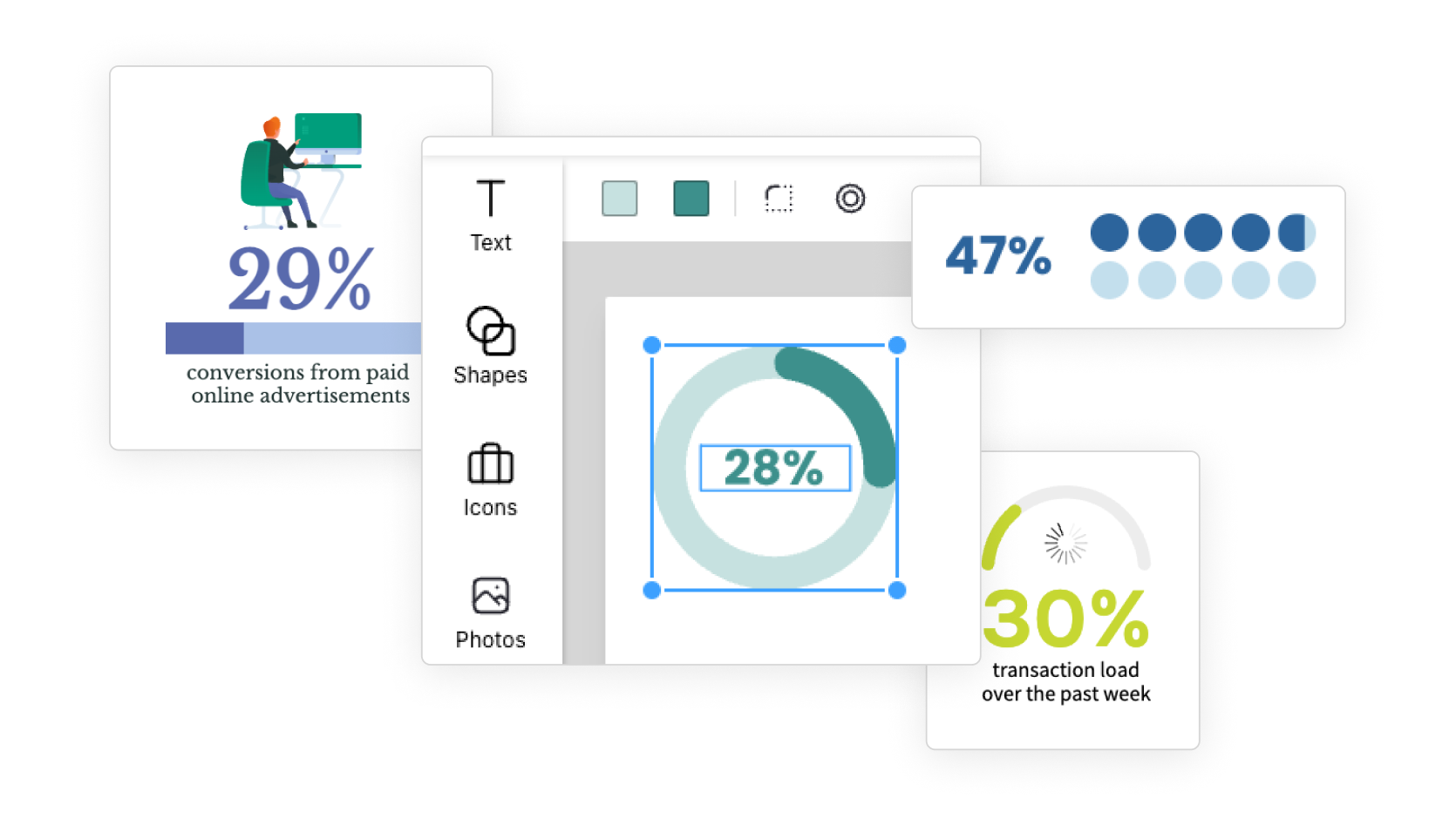
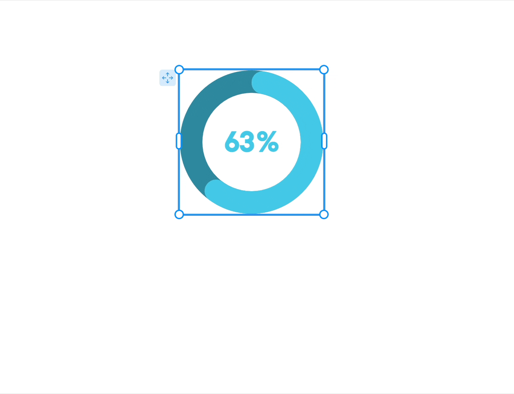
Through user interviews and qualitative research into our templates and user designs, I identified a common use case where the editing flow was tedious but the users’ desired output was consistent and predictable: visualizing a single statistic, a percentage with a simple chart, some text, and often an icon.
This was a good opportunity to simplify the user experience without compromising on the quality of the resulting designs.
This type of simple visualization is a feature of many user designs and templates. For users to update a design with their data, they had to edit and adjust each component separately, including:
If the user wanted to try out a different chart type or add or remove an icon, they’d have to reconfigure the composition completely: moving, resizing, and adjusting each component to make the layout presentable.
As a result, most users stuck very closely to the template design, even if that wasn’t ideal for their content, or how they wanted to display their data.
The widget must be flexible enough in style and structure to replicate the way this type of data is represented in existing templates, all while responding to the user’s content.
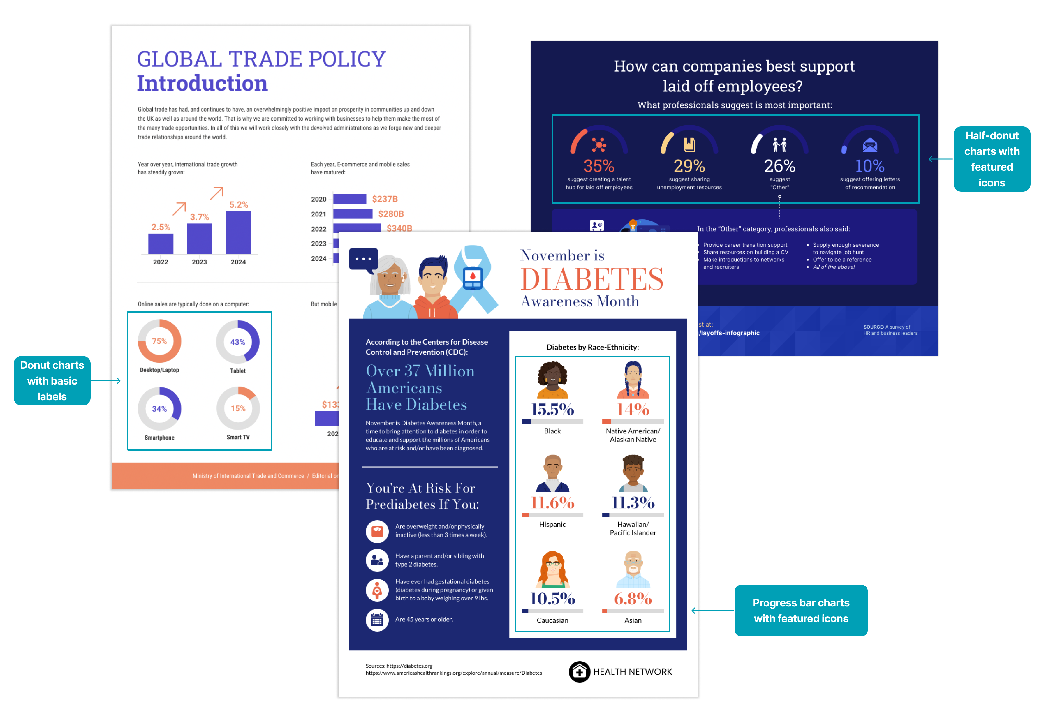
I collected and analyzed examples of this use case from both templates and user designs, and defined the following similarities and variations:
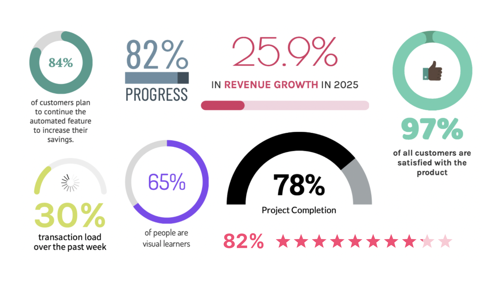
After cataloguing a variety of examples from user designs and templates, I categorized them with the goal of understanding what unique considerations each combination of chart type and layout might require for the resizing behaviour.
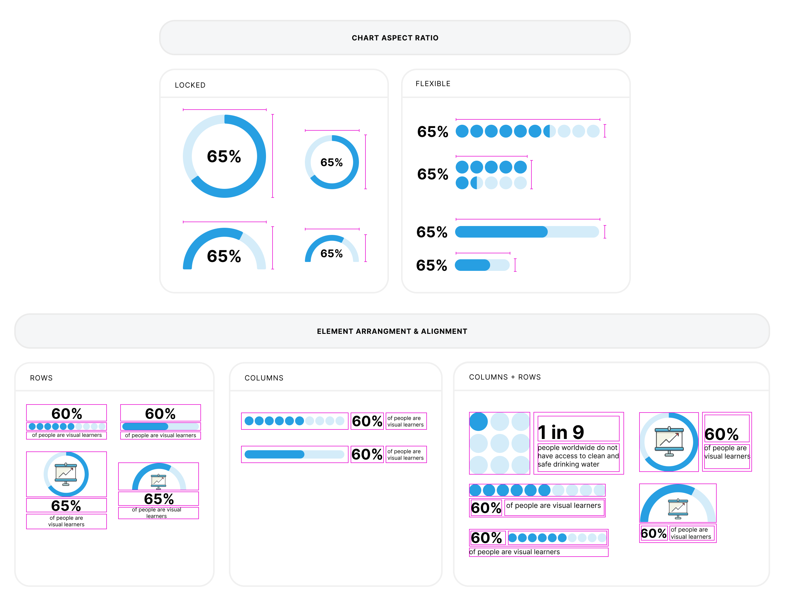
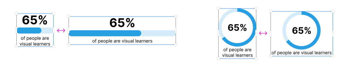
The resizing behaviour for layouts that included only one element with a flexible aspect ratio in a row seemed simple enough to define: the elements with fixed aspect ratios could remain the same size while the element with a flexible aspect ratio could adjust to fill the available space while the widget was resized.
The height of the widget could respond to the changes, as necessary, consistent with the resizing behaviour for our existing text widget.
Since the alignment of elements within the widget tended to be consistent for each layout type (arrangement of elements), that didn't need to be under user control—it could simply be defined as part of the layout.
But if we wanted to offer layouts that combined a flexible-aspect ratio chart and the flexible-aspect ratio description text in the same row, we would need to define how the the width of each component would change as the widget was resized (or define a method to resize elements within the widget, rather than resizing the widget itself).
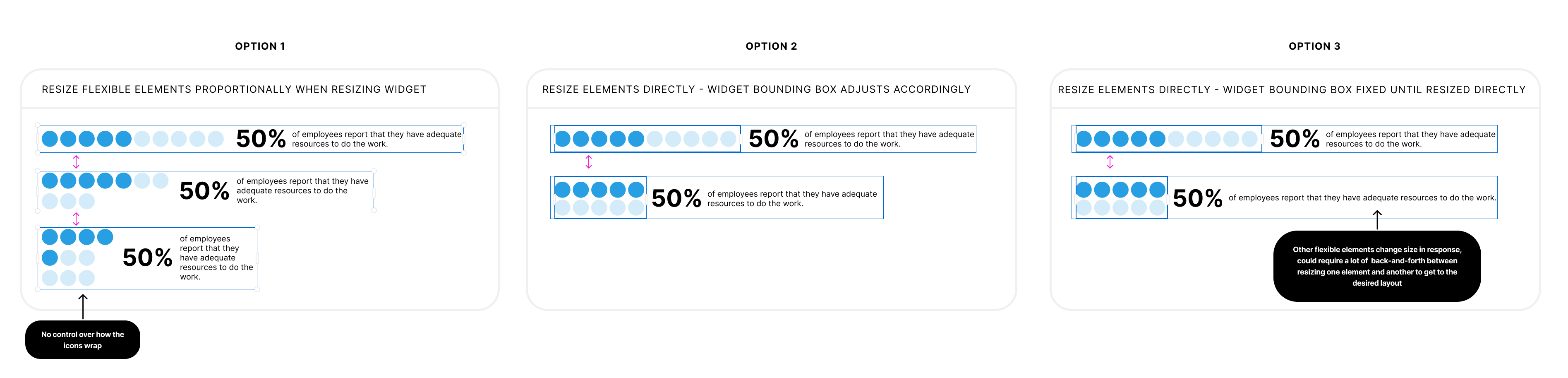
I spent some time defining and prototyping possible approaches and testing them internally. Realizing that this could be a bit of a rabbit hole, I spoke to a developer to get a sense of the technical complexity involved for each option. As it turned out, the preferred option (Option 2) would significantly increase the technical complexity and effort to build the widget. With this in mind, we decided to stick to the row-only and column-only for our first version, with the potential to expand the available layouts in future depending on interest from customers.
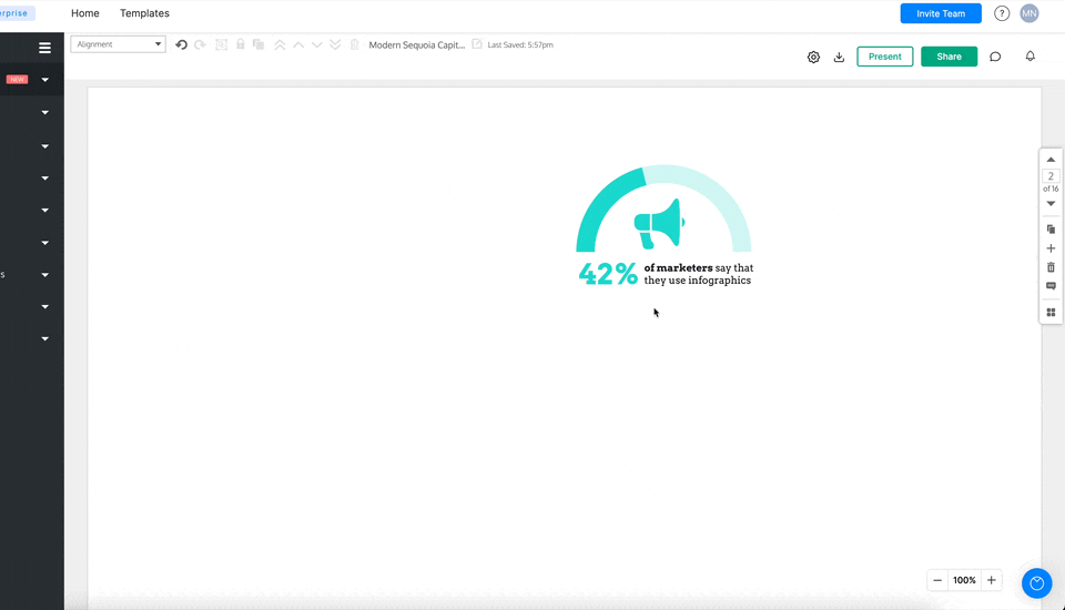
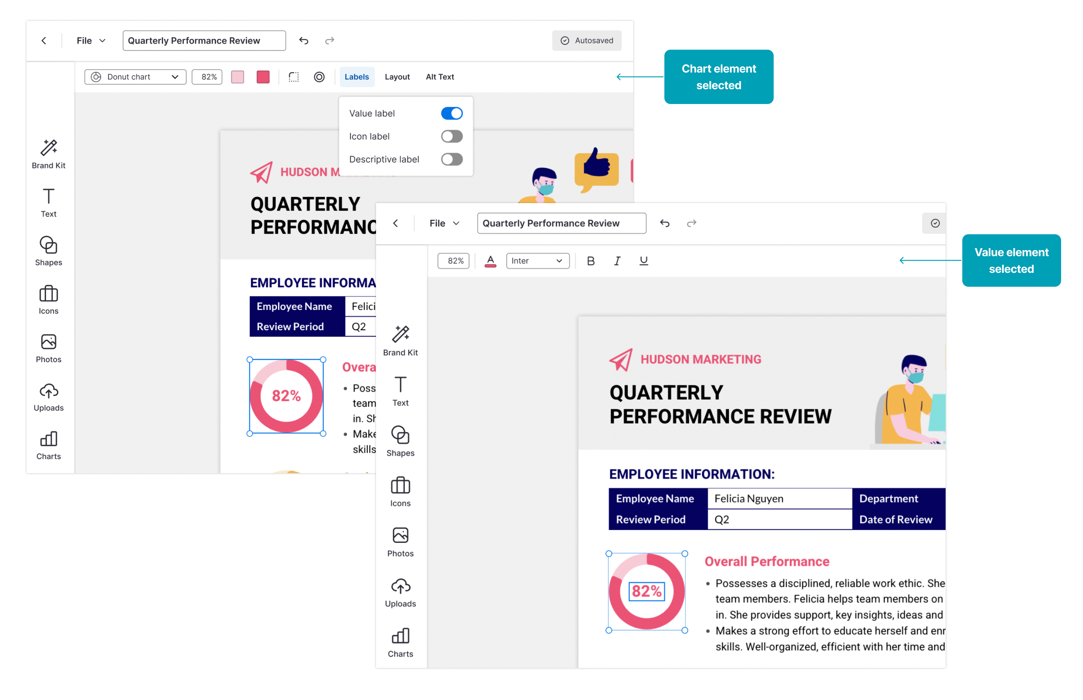
Another decision to be made in the design of this widget was where to put the controls for widget customization.
I wanted to follow existing patterns: for most widgets, including text, customization options were available in the in-context toolbar. The settings for more complex widgets that required more settings and a data table to accept data input, like charts and maps, were located in a large menu on the right side of the screen, which was only visible while working with those widgets.
I wasn't initially sure whether to maintain consistency with the text widget or the chart widgets in this case (or use some combination of the two)—arguments could be made for each option, and there were other tradeoffs to consider with each option.
What ultimately swayed the decision to using the in-context toolbar was a technical limitation: it would be significantly lower effort if we offered a simple input field for users to edit the chart value, rather than supporting on-canvas WYSIWYG editing (which would have been preferred, as a design principle at Venngage is to encourage direct manipulation where possible).
Since editing the value would be the primary interaction with this widget, it should be as low-friction as possible. With the in-context toolbar, it would require one less step for the user to edit, compared to the right menu.
💪 Since its release, this widget has become Venngage’s most-used chart widget.
📈 Users who use the new widget complete their designs 24% more than those who used the old freeform components.
💬 We’ve also had positive reactions from power users.
During one user test, a user audibly groaned when asked to edit one of these charts. She assumed that it was made up of static, independent components (like they used it be) and was not happy about being asked to edit it. She was very pleased to learn that the new widget was dynamic, so she only had to edit the data in one place and see the changes reflected both in the chart and the text.